

Project
Remi Cachet X The King's Trust
Overview
A collaboration between Remi Cachet and The King’s Trust, celebrating potential that can change lives through a limited-edition brush, packaging and campaign, highlighting the partnership, founder story and purpose.
Expertise
Campaign Identity
Marketing Material
Digital Media
Packaging Design
THE SOLUTION
A campaign bringing together the established Remi Cachet identity with The King’s Trust’s distinctive visual language, balancing product performance with a story of belief, opportunity and giving back.
The campaign centres around a visual red thread, using The King’s Trust’s signature red to create a clear change from BAU while working within the Remi Cachet palette. The thread represents the belief and support that enabled Remi Cachet’s success, connecting the founder story, partnership and purpose.
The brush and packaging sit at the heart of the campaign, combining recognisable Remi Cachet elements with The King’s Trust’s visual language to create a premium, considered experience.
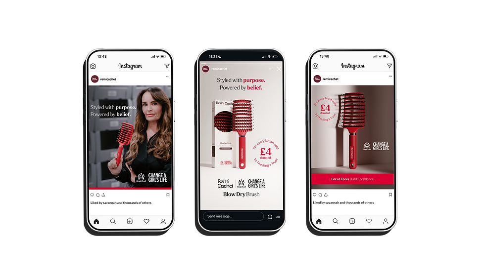
Across digital, the product remains the focus, with the PDP combining product USP graphics with storytelling about Victoria and The King’s Trust’s role in backing her potential. Clear donation messaging introduces Change a Girl’s Life, creating a full-circle moment where Remi Cachet can support the next generation.





Brand Values

THE PACKAGING
The packaging stays true to the Remi Cachet range, with a twist to reflect the collaboration with The King’s Trust. A box format creates more space for storytelling and gives prominence to the partnership. The King’s Trust red provides a bold accent, with a visual red thread representing the belief and support behind the brand’s success. Inside, a pop of claret nods back to Remi Cachet, while a die-cut window allows the brush bristles to be seen and touched. With both logos feature prominently, reinforcing the collaboration throughout.


DESIGN ESSENTIALS
A flexible visual system creates consistency across every touchpoint, using lozenge banners, roundels and contrasting colour treatments to highlight key messages. Limited-edition and donation callouts reinforce the campaign purpose, while the visual red thread runs throughout the assets, creating a recognisable connection across the campaign.


PDP Website Assets


