

Project

Packaging + Art Direction
THE CHALLENGE
A full packaging overhaul for hair extension brand Remi Cachet, following a rebrand + renewed brand strategy. The ask, translate the new positioning into a cohesive packaging system across multiple product ranges, while creating a stronger, more premium and recognisable experience.
Expertise
Packaging Design
Product Design
Dieline Templating
Art Direction
Artworking
THE SOLUTION
Translating Remi Cachet’s new brand strategy into a complete packaging system that feels more premium and unmistakably brand-led.
The existing packaging was outdated and lacked the premium presence to reflect the repositioned brand. It also needed to respond to a growing focus on more considered, eco-conscious packaging and work more effectively across a diverse product portfolio.
The redesign creates a stronger shelf presence through bold colour and a clear visual hierarchy. Consistent brand elements bring the ranges together, while considered structural choices elevate each product, creating a more confident and distinctive packaging system that is easier to recognise and navigate.
Developed from concept through to production, covering structural formats, dielines, artwork, materials, finishes and physical samples. The art direction extended beyond packaging into campaign identities, marketing materials, print and digital, creating consistent touchpoints across the brand.
The result is a refreshed packaging experience that strengthens Remi Cachet’s brand consistency and brings a bold, premium presence to the brand.
THE CHALLENGE
A full packaging overhaul for hair extension brand Remi Cachet, following a rebrand + renewed brand strategy. The ask, translate the new positioning into a cohesive packaging system across multiple product ranges, while creating a stronger, more premium and recognisable experience.
Expertise
Packaging Design
Product Design
Dieline Templating
Art Direction
Artworking
THE SOLUTION
Translating Remi Cachet’s new brand strategy into a complete packaging system that feels more premium and unmistakably brand-led. The existing packaging was outdated and lacked the premium presence to reflect the repositioned brand. It also needed to respond to a growing focus on more considered, eco-conscious packaging and work more effectively across a diverse product portfolio. The redesign creates a stronger shelf presence through bold colour and a clear visual hierarchy. Consistent brand elements bring the ranges together, while considered structural choices elevate each product, creating a more confident and distinctive packaging system that is easier to recognise and navigate. Developed from concept through to production, covering structural formats, dielines, artwork, materials, finishes and physical samples. The art direction extended beyond packaging into campaign identities, marketing materials, print and digital, creating consistent touchpoints across the brand. The result is a refreshed packaging experience that strengthens Remi Cachet’s brand consistency and brings a bold, premium presence to the brand.
Project
01.
Aftercare Range
THE SOLUTION
A considered colour palette gives each product its own aesthetic while keeping the collection connected, with primary colourways defining the core range and secondary tones future-proofing the system for new products.
A bold lozenge highlight signifies the “Original” range, while line details draw focus. Texture labels bring a premium finish, with an additional peekaboo colour pop across the boxes and samples for a subtle visual detail.
Fitting the required translations and Triman emblems across varying bottle and label sizes was a key challenge, requiring compromises to keep the overall aesthetic consistent.
DELIVERABLES
Full Aftercare Range
Duo + Trio Box
Aftercare Sample Pack
Styling Products


Website Assets


Website Assets


Aftercare sample pack


Website Assets
Project
02.
Extension Collection
THE SOLUTION
With a high number of SKUs across three distinct hair ranges, the challenge was creating clear differentiation while keeping the collection cohesive.
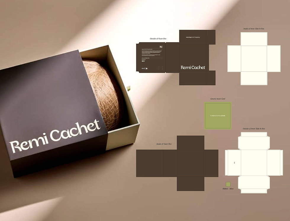
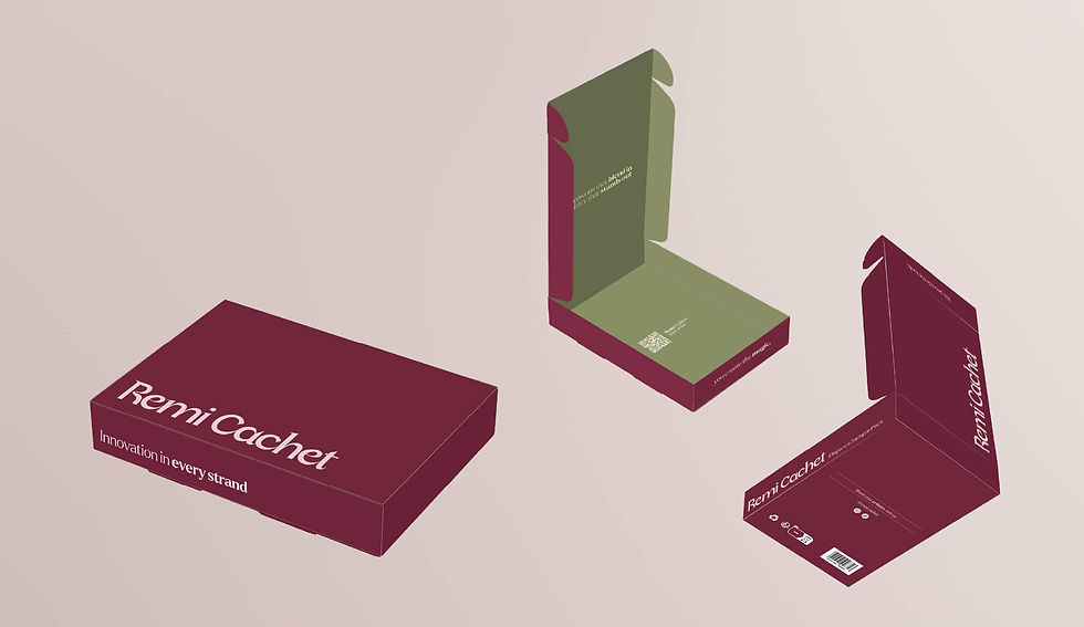
Claret, Petal and Carrara give Elegance, Deluxe and Luxury their own distinctive aesthetic, with pops of Orchid adding a consistent brand detail across the stickers. Hero branding takes centre stage across the bags and boxes, while interchangeable colour pops allow the packaging to flex across different products.
Biodegradable and recyclable packing bags support a more considered approach, with custom sticker labels providing a flexible solution for product details where screen printing wasn’t possible, while keeping the overall packaging system consistent.
DELIVERABLES
Elegance Hair Packaging
Luxury Hair Packaging
Deluxe Hair Packaging
Hair Pieces Box
Elegance Sample Pack


Website Assets


Mission Statement


Website Assets


Website Assets



Project
03.
Brush Range
THE SOLUTION
The existing brush packaging needed a rethink, with brushes falling out and packs becoming damaged during handling. The solution was a restructured format with a heavier card weight, revised dieline and an eco-conscious bamboo twine fastening for a more secure finish.
Hero logo placement strengthens the brand presence, while a message revealed beneath the brush creates an added detail when the product is removed. A bold lozenge detail connects the range back to the wider packaging system, with an internal green pop adding a considered pop of colour to the unboxing experience.
DELIVERABLES
Paddle Brush Sleeve x2
Mini Brush Sleeve x2
Blow Dry Brush Sleeve x3
Smoothing Brush Sleeve x2


Website Assets


Brand Values


